Concept & Strategy
Graphic & Web Design
Website Programming
HTML/CSS & WordPress
Online-Shops
© 2024 Alle Rechte vorbehalten.
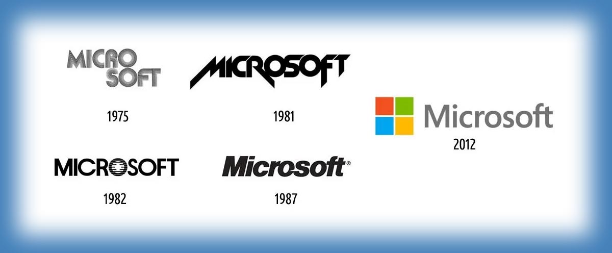
Why big brands redesign their logos